// UNIVERSITY
MAKING LOCAL ELECTION INFO EASY TO ACTUALLY FIND
A voter-facing tool that pulls scattered candidate information into one place, built around what voters said they actually wanted to know.
- CLIENT
- University project
- ROLE
- Research, Usability testing, Prototyping
- DURATION
- 3 weeks
- YEAR
- 2023
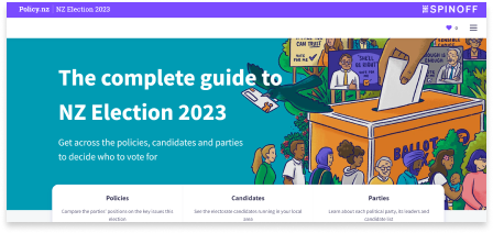
Local body elections in New Zealand have a turnout problem, and a lot of it comes down to information: pamphlets that read like fine print, a government site that buries what you need under what it wants to tell you, and billboards that are basically just a face and a slogan. None of it answers the question a voter actually has, which is closer to "what will this person do if I vote for them."
The research question we settled on: what are the design opportunities for effectively communicating essential information about candidates to potential voters in local body elections? We had three weeks to answer it.
Finding the actual question
Our research ran on two tracks. Desk research covered how the electoral system works and what's already documented about why people don't vote in local elections. Primary research was about what information voters actually want — with two objectives: find out which candidate details voters consider essential, and assess how reliable and effective the current sources (pamphlets, policy.nz, billboards) actually are.
Concretely, that meant guerrilla interviews around Wellington with people who were eligible to vote but hadn't necessarily made up their minds — plus a longer conversation with a sitting Wellington-region candidate, which turned out to be the most useful hour of the project. She walked us through how the pamphlet process works from the candidate's side: a fixed word limit, a photo, and an email deadline. That explained a lot about why the current information is so thin — candidates are optimizing for a format, not for a voter trying to decide.
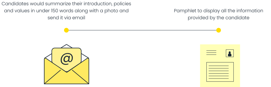
What came out of the interviews was consistent: people wanted to compare, not just read. They didn't want a wall of policy text for one candidate at a time — they wanted to see candidates side by side on the things they personally cared about: background, values, policies, and track record.
From sketches to something testable
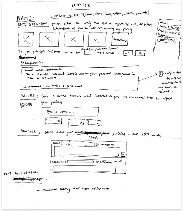
The insight pointed at a two-part solution: a structured submission form that helps candidates articulate the information voters actually want, and a standardised display format so voters can compare like with like. If the input is structured, the comparison comes almost for free.
We started on paper, working out what the form needed to ask and how to constrain answers without flattening every candidate into the same person:
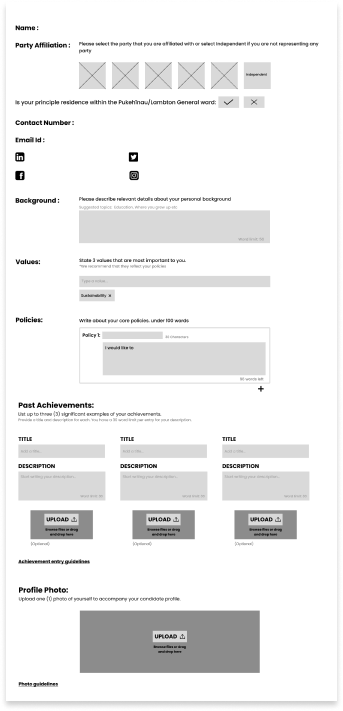
Then into low-fidelity wireframes, built rough on purpose — we wanted to break them in usability sessions rather than polish something that solved the wrong problem:
What testing caught
Usability sessions on the lo-fi prototype surfaced four specific problems — each one obvious in hindsight, none of them things we'd have caught by staring at our own screens:
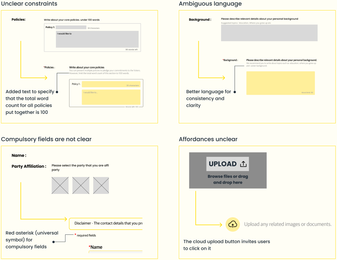
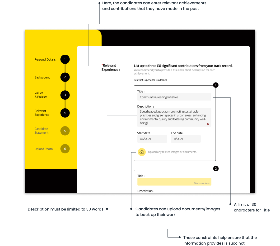
- Unclear constraints — testers couldn't tell if the 100-word limit applied per policy or across all policies. We rewrote the helper text to spell it out.
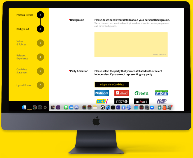
- Ambiguous language — "describe your background" got wildly different interpretations. We added suggested topics and a word limit so candidates know what's expected.
- Compulsory fields weren't marked — fixed with the boring, universal red asterisk. Sometimes the convention is the answer.
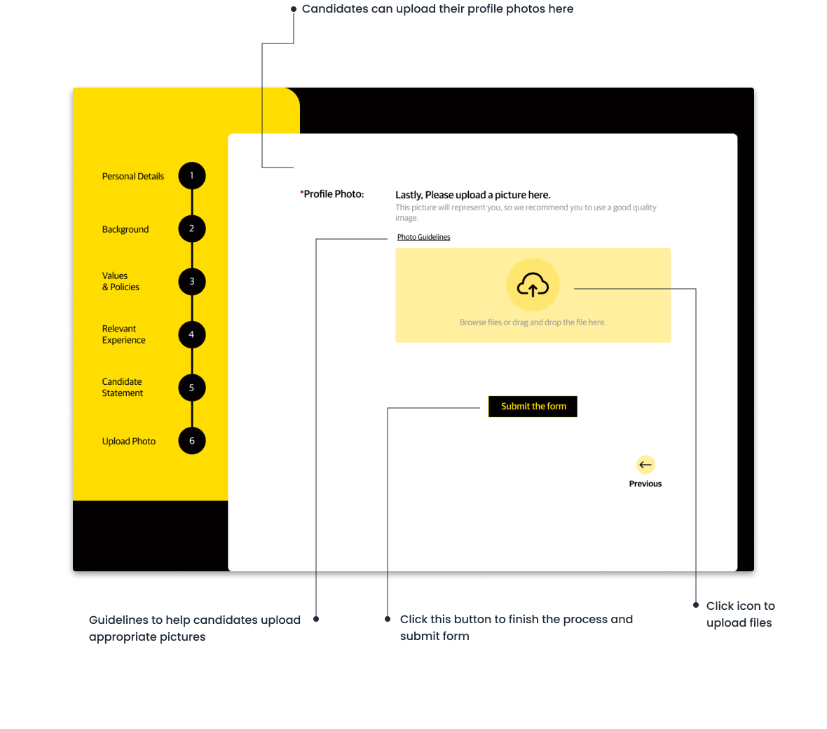
- Weak affordances — the upload area didn't look clickable. A proper upload button with a drag-and-drop zone fixed it.
The final prototype
The high-fidelity prototype borrows Wellington City Council's type and colour deliberately — the goal wasn't to introduce a new visual language, it was to feel like an extension of a source voters already treat as official.
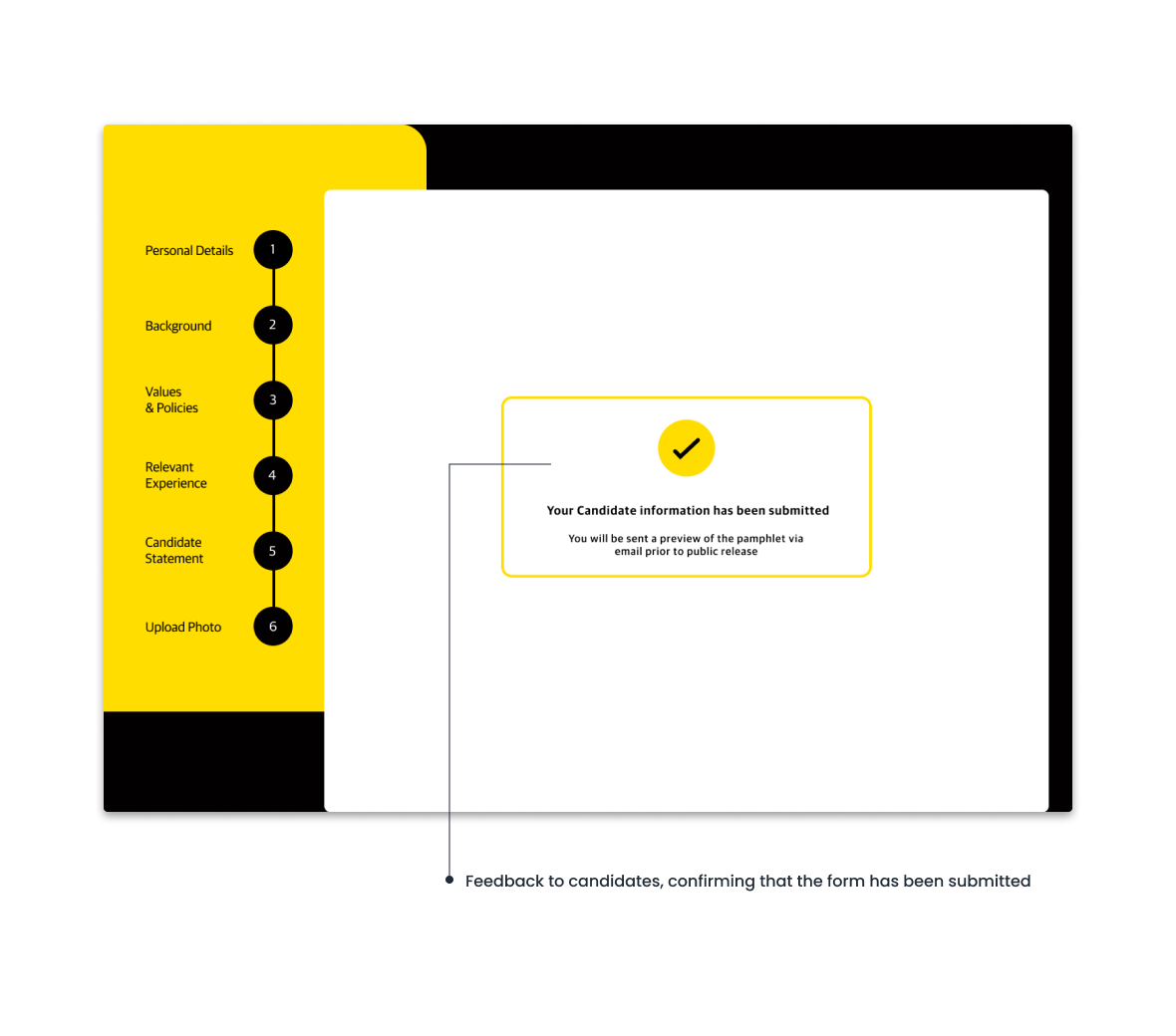
The form walks a candidate through six steps, with a progress rail so they always know where they are:
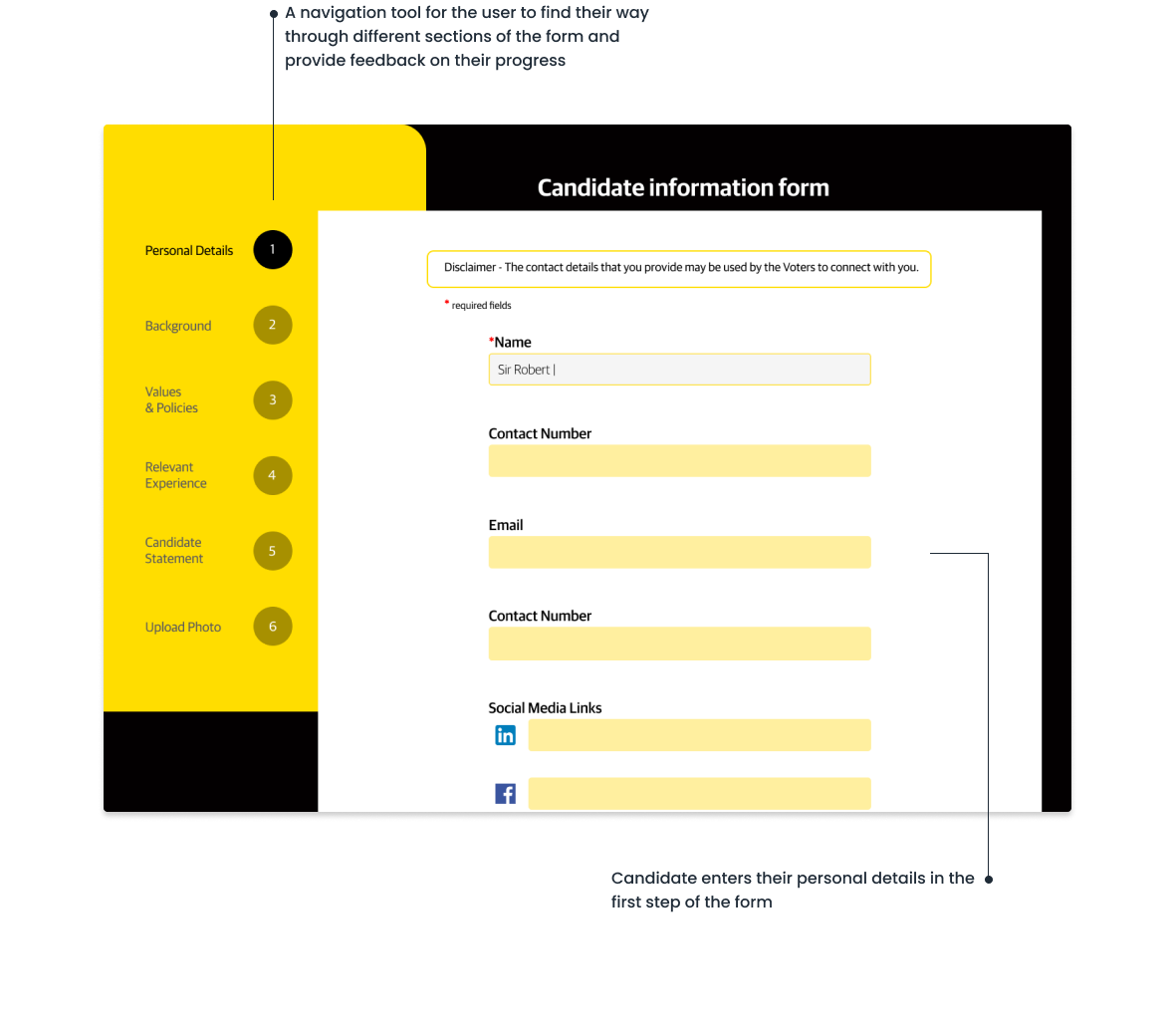
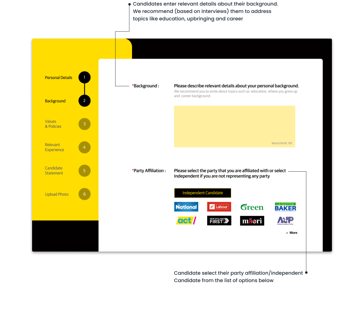
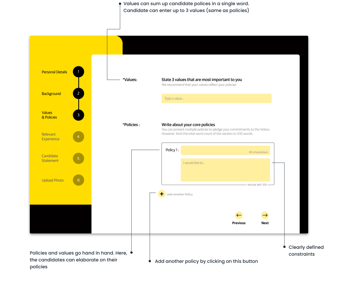
You can click through the interactive prototype on Figma to see the full flow.
Where it doesn't reach yet
Two honest gaps, both flagged for a next round:
- Comparison view. The current prototype structures the data for comparison but doesn't yet build the side-by-side view voters asked for — that's the obvious next screen.
- The candidate's perspective. We built this from the voter's side. Before this could ship, candidates would need to be interviewed properly to check the format presents them the way they want to be presented — a form that flattens platforms into checkboxes would fail them, and eventually voters too.