// UNIVERSITY
UNTANGLING THE IA FOR 2,000+ RESEARCH ARTICLES
Consumer NZ was moving to a new CMS with no real information architecture behind it. We rebuilt the structure, the tagging, and the search experience around how people actually look for research.
- CLIENT
- Consumer NZ
- ROLE
- IA, Research, Usability testing, UI
- DURATION
- 10 weeks
- YEAR
- 2024
Consumer NZ is the independent org that tests products and pushes for fairer treatment of consumers here — think of it as New Zealand's answer to Which?. It's funded by members, not advertisers, which is exactly why its site needs to work: the research is the product.
The problem was that the site had grown to roughly 2,000 articles with almost no real structure behind them. Only a small percentage were reachable through topic pages or the menu at all; the rest just sat there, findable only if Google happened to surface them. The existing CMS kept content completely flat — no vertical hierarchy — so there was no efficient way to group research content even when someone wanted to. With a re-platform onto a new CMS coming in 2025, this was the one window to fix the structure before it got locked in again for years.
Diving into research
We wanted to understand both sides of the problem — what users couldn't find, and why the organisation had ended up here. Five methods, each with a specific job:
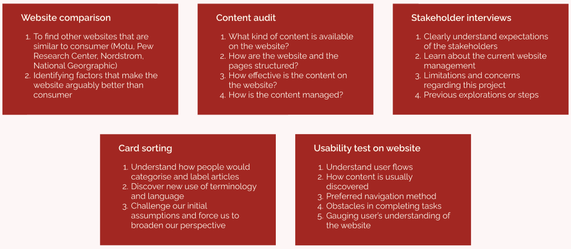
- Website comparison — studying how Motu, Pew Research Center, Nordstrom, and National Geographic handle large content libraries, and what makes them navigable where Consumer wasn't.
- Content audit — what content actually exists, how pages are structured, how it's managed.
- Stakeholder interviews — expectations, current site management, limitations, and what had already been tried.
- Card sorting — how real people would categorise and label articles, which challenged our assumptions and surfaced vocabulary users actually use.
- Usability testing on the existing site — user flows, how content gets discovered, preferred navigation methods, and where tasks broke down.
The card sorting was the revealing one: "how the org organises it internally" and "how a reader looks for it" turned out to be two different taxonomies. And usability testing made the cost visible — people abandoned searches, missed related articles sitting one click away, and generally didn't trust that the site "knew" what else it had on a topic.
Finding the link
With five research streams running, the risk was ending up with five piles of disconnected findings. So the next step was deliberately convergent: going back over everything to find where stakeholder needs and user needs actually pointed at the same problem.
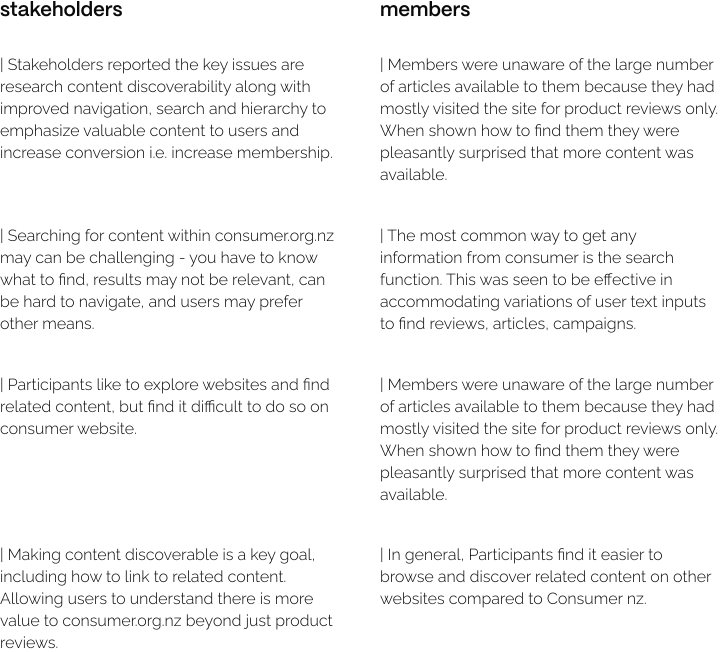
That link became the foundation for the design work: five areas where fixing one thing served both sides.
Designing for improvements
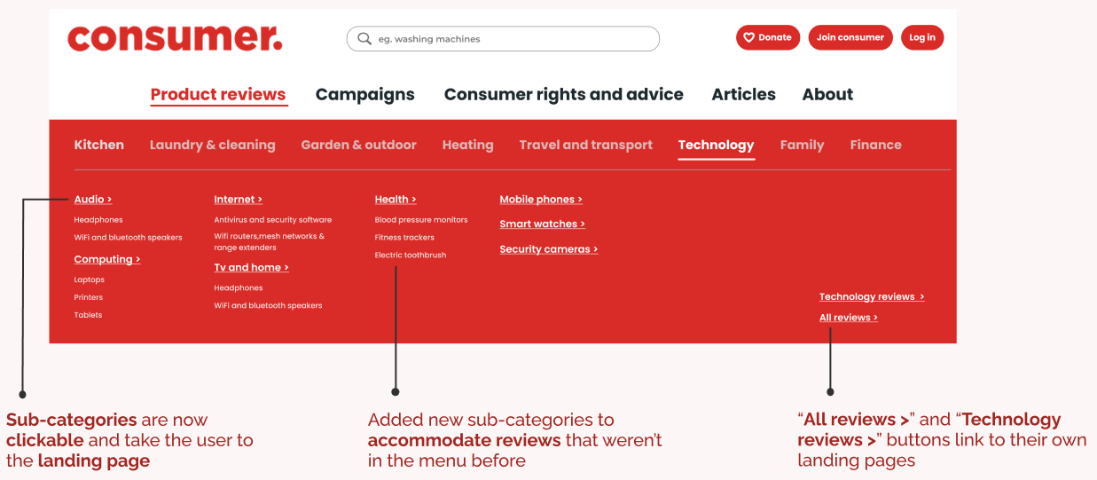
Navigation menu. Restructured around topics people search for, with sub-categories that are now clickable and headroom for new categories — rather than a fixed list needing surgery every time Consumer publishes something new.
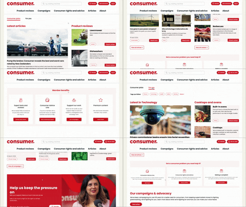
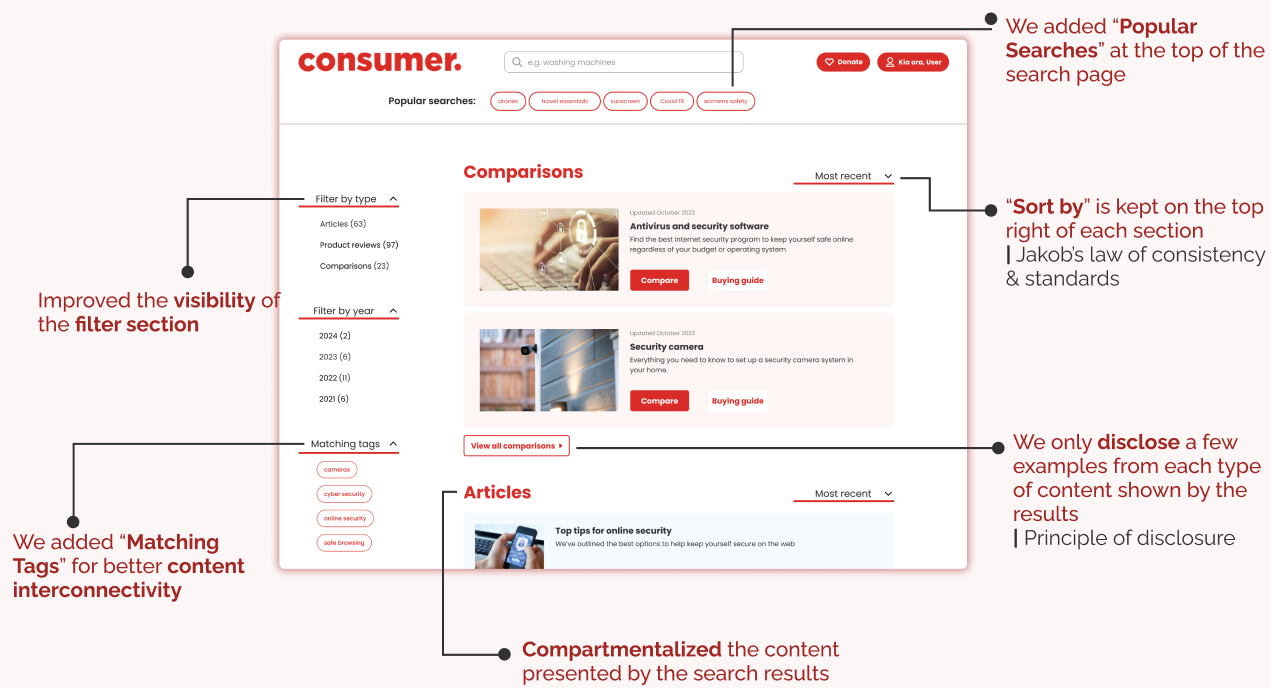
Search. Popular searches surfaced at the top, filters made visible, matching tags added for interconnectivity, and results compartmentalised by content type instead of one flat list — showing a few examples of each type rather than drowning the user.
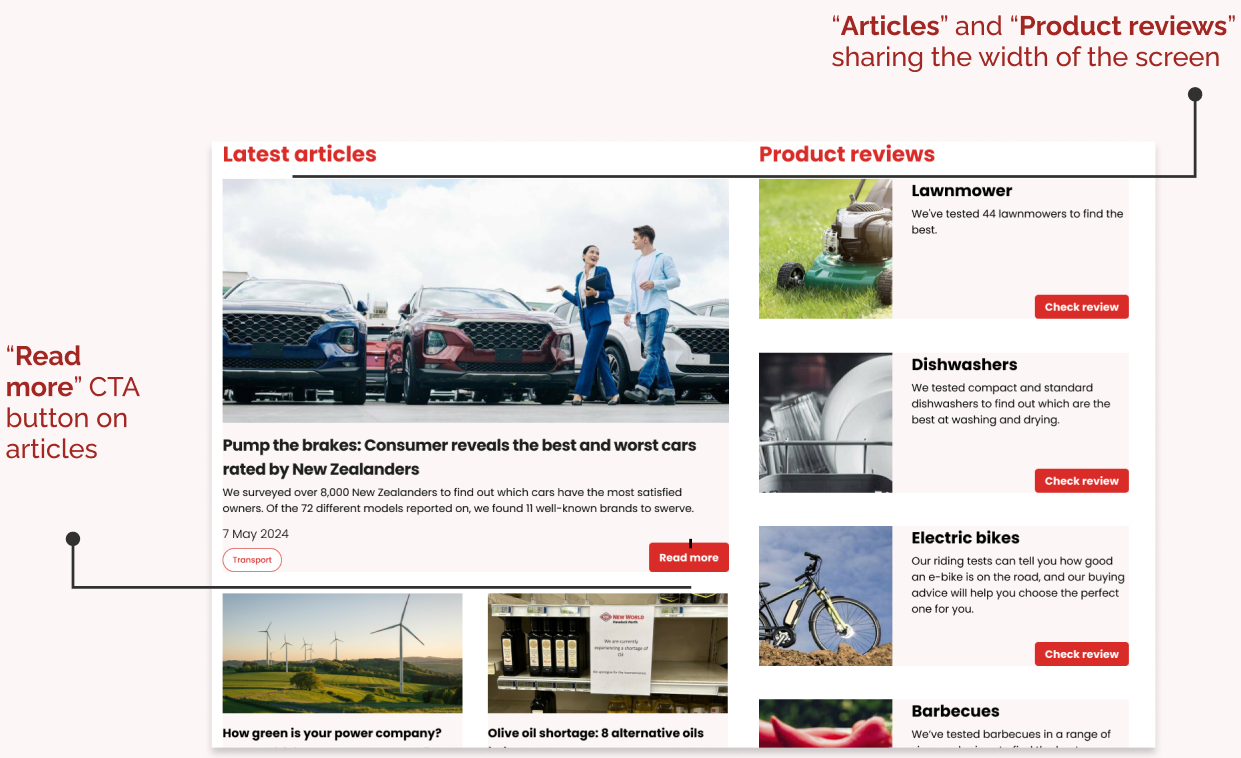
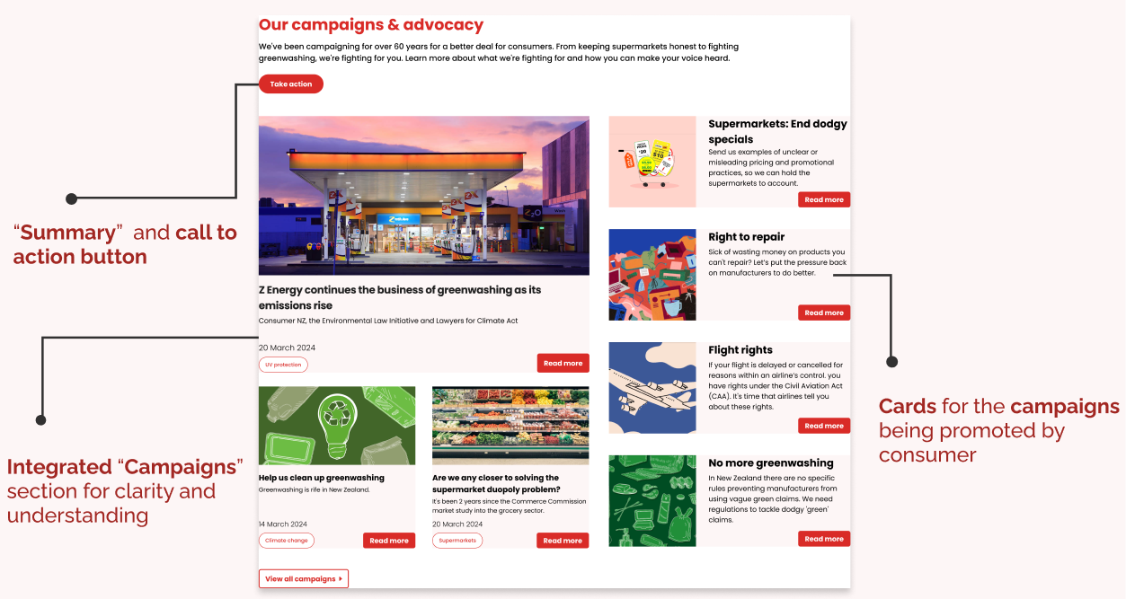
Homepage hierarchy. Articles and product reviews now share the width of the screen with clear CTAs, and campaigns get an integrated section — so the homepage reflects everything Consumer does instead of burying half of it.
Breadcrumbs. Added consistently, since a lot of traffic lands mid-site from search rather than the homepage, and there was previously no way back up the tree.

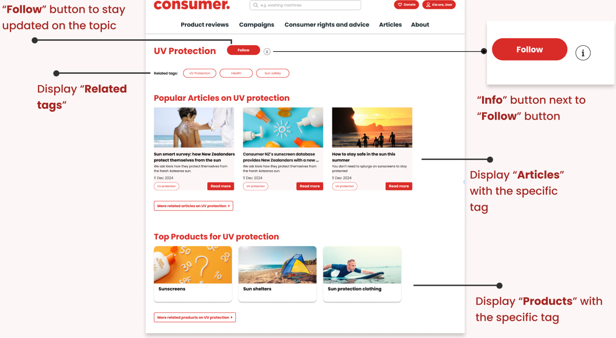
Tagging. A real tag system connecting related articles and products, with follow buttons per topic — so reading one review surfaces the other nine that matter.
The new structure
The revised IA gives Consumer room to grow — new categories slot into the tree instead of piling up in a flat list.
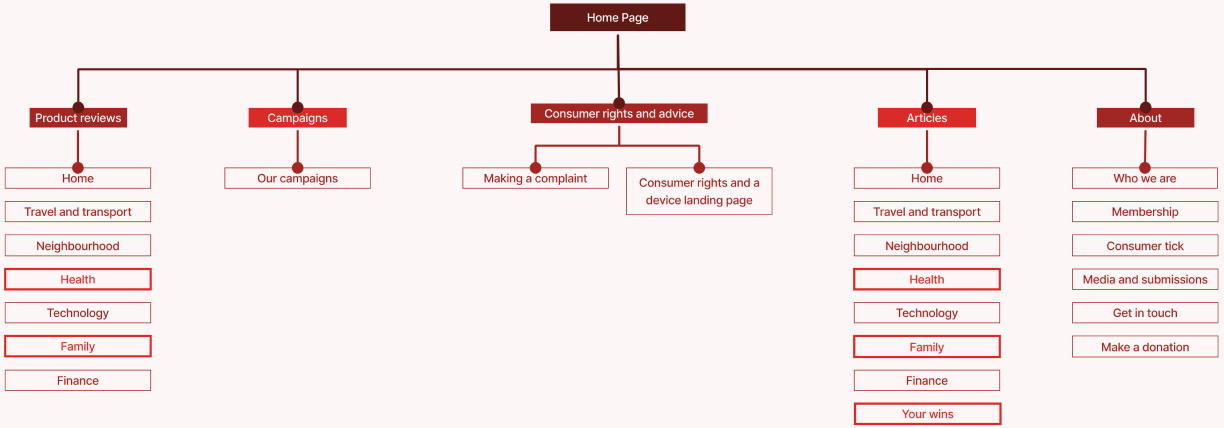
You can click through the full redesign in the interactive Figma prototype.
What ten weeks with a real client taught me
This was the first project where I was coordinating four other people rather than just doing the work myself, and that ended up being as much the lesson as the IA itself:
- Engage stakeholders early and often — buy-in at the start saved us from redoing a full round of card sorting later.
- Leading a team is its own workload — keeping five people pointed at the same version of the plan is real work, not overhead.
- Structured planning pays off — an actual timeline with checkpoints is what kept ten weeks from evaporating.
- Design systems need maintaining — we built shared components early so five people's screens looked like one product.
- Collaborative problem-solving beats solo heroics — the best IA decisions came out of arguments between five perspectives, not any one person's first idea.